You use CRM data every day, but raw tables and lists hide the patterns that help you sell more and keep customers happy. Visualizing CRM data turns contacts, deals, and activity into clear charts and dashboards so you can spot trends, measure outcomes, and act faster.
Good CRM data visualization shows the right metrics at the right time so you make better decisions without digging through spreadsheets. This article will show what effective visualization looks like, practical best practices, how to implement visual tools, and the trends shaping the future of CRM insights.
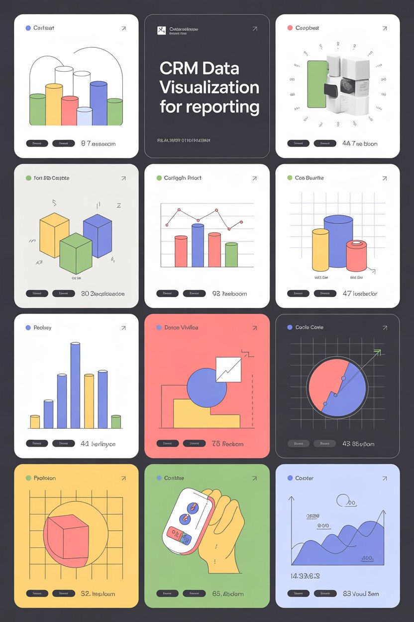
Understanding CRM Data Visualization
CRM data visualization turns customer information into clear pictures you can act on. It shows sales trends, customer segments, and service issues so you can make faster, data-driven decisions.
Definition of CRM Data Visualization
CRM data visualization uses charts, graphs, maps, and dashboards to show customer-related data from your CRM system. It pulls data like purchase history, lead status, support tickets, and engagement metrics and displays them visually so patterns become obvious.
You can spot trends such as rising churn or peak buying days without scanning raw tables. Visuals often update in real time, letting you monitor campaign performance, sales pipeline health, and rep activity.
Common elements include interactive dashboards, time-series charts for revenue, funnel charts for conversion stages, and heat maps for geographic distribution. These visuals link back to underlying records so you can drill down and take action on specific accounts or leads.
Key Benefits for Organizations
Visualization reduces the time you spend analyzing CRM data and increases the speed of decisions. You can quickly compare sales rep performance, identify lost deals, or measure campaign ROI.
It improves alignment across teams by presenting the same metrics in one view. Marketing, sales, and service can use shared dashboards to focus on the same targets and avoid conflicting reports.
Visualization also helps you prioritize work. For example, a pipeline heat map can highlight high-value deals at risk, so you assign resources where they matter most. Visuals make forecasts more reliable by exposing seasonal patterns and outliers.
Types of CRM Visualizations
Sales pipeline charts show deal stages and value and let you see conversion rates between stages. Use funnel or stacked bar charts for this view.
Dashboards combine multiple widgets—KPIs, time-series, leaderboards—to give a snapshot of performance. You can customize dashboards by role, such as account managers or support leads.
Geographic maps plot customer locations and sales density, useful for territory planning. Heat maps reveal concentration and gaps.
Time-series charts track revenue, new leads, or support tickets over days, weeks, or months. Scatter plots and bubble charts help you analyze relationships like deal size versus close time.
Tables with conditional formatting and sparklines work well for detail-level review while keeping trends visible. Interactive filters and drill-downs let you move from summary to record-level detail quickly.
Best Practices for CRM Data Visualization
Focus on picking tools that match your team’s skills, keeping data clean and consistent, and using clear design choices that guide viewers to the right insights. These steps help you build visuals that support faster decisions and fewer mistakes.
Choosing the Right Visualization Tools
Select tools that match your technical skills and report needs. If you need quick dashboards and non-technical users, choose drag-and-drop platforms like Tableau, Power BI, or Google Data Studio. If you need heavy customization or predictive visuals, consider Python libraries (Matplotlib, Seaborn) or R (ggplot2), but plan for developer time.
Check data connector support. Confirm the tool can connect to your CRM (Salesforce, HubSpot, Microsoft Dynamics) and to your databases. Evaluate refresh frequency, export formats, and role-based access.
Compare cost, scaling, and training. Estimate license fees, performance with large datasets, and whether your team can learn the tool quickly. Proof-of-concept reports help you test performance before committing.
Data Quality and Preparation
Start by auditing fields you will visualize: ensure consistent naming, remove duplicates, and fix missing values. For example, standardize lead source values and convert date fields to a single format.
Aggregate data at the right level. Use daily or weekly granularity for activity trends, and account-level aggregation for deal pipelines. Create calculated fields for KPIs like conversion rate = deals/qualified_leads to avoid repeated logic in reports.
Document transformations and lineage. Maintain a simple data dictionary and record ETL steps so you can trace a chart back to its source. Automate refreshes and include validation checks to catch anomalies quickly.
Design Principles for Effective Visualizations
Use simple chart types that match your question. Use line charts for trends, bar charts for category comparisons, and stacked bars only when parts add to a whole. Avoid 3D charts and excessive color that distracts from the data.
Apply consistent color and labeling. Assign fixed colors to key segments (e.g., won = green, lost = red). Add clear axis labels, concise titles, and unit markers like “Revenue ($)” so viewers understand scale.
Prioritize readability and action. Highlight the key metric with size or color, add brief annotations for anomalies, and provide interactive filters for time range, region, or sales rep. Make exported data available for users who need deeper analysis.
Implementing CRM Data Visualization Strategies
You will connect visualization tools, shape dashboards for each role, and protect data while following rules. These steps make your reports accurate, useful, and compliant.
Integrating Visualization Solutions with CRM Platforms
Start by checking your CRM’s integration options: native connectors, APIs, and middleware like Zapier or Mulesoft. Choose a method that supports real-time or near-real-time sync if you need live sales or support metrics.
Map the key CRM objects (accounts, contacts, opportunities, cases) to your visualization datasets. Define update frequency, field transformations, and how you’ll handle deleted or merged records. Create a staging area or data warehouse if you run heavy joins or historical analyses.
Test the integration with a small dataset first. Validate record counts, date fields, currency conversions, and multi-currency behavior. Monitor latency and set alerts for sync failures. Document connection credentials, OAuth tokens, and rotation schedules.
Customizing Dashboards for Key Stakeholders
Identify stakeholder groups: sales reps, account managers, executives, and support teams. For each group, list top KPIs, required filters, and the typical workflow that uses the dashboard.
Design layouts with purpose: single-metric tiles for executives, trend charts and funnels for managers, and record-level tables with quick actions for reps. Use consistent color codes and clear labels to reduce misinterpretation. Provide saved views and role-based access so users see only relevant data.
Include interactive elements: date pickers, region filters, and drill-down links to CRM records. Train users with short guides and in-app tips. Collect feedback through brief surveys and update dashboards quarterly or when processes change.
Ensuring Data Security and Compliance
Apply the principle of least privilege: grant users only the data and actions they need. Use CRM role hierarchies and visualization tool permissions to enforce restrictions.
Encrypt data in transit and at rest. Store API keys and credentials in a secured secrets manager. Rotate keys on a scheduled basis and log all access to dashboards and datasets.
Follow applicable regulations like GDPR, CCPA, or industry-specific rules. Mask or pseudonymize PII in visualizations when full details are unnecessary. Maintain audit trails for data exports and report generation. Conduct regular compliance reviews and update data retention policies accordingly.
Emerging Trends in CRM Data Visualization
You will see faster, smarter visuals that predict outcomes and dashboards built for mobile use. Expect tools that surface patterns automatically and let you act from your phone.
AI-Powered Data Insights
AI now finds patterns in customer behavior that you might miss. It can score leads, flag churn risk, and recommend the next best action. This helps you prioritize high-value contacts and reduce time spent on low-impact tasks.
Use cases matter: AI-driven forecasts adjust sales targets when win rates change. Sentiment analysis turns support notes into measurable trends. Visuals update in real time, showing predicted revenue by account or probability heat maps for deals.
Pay attention to transparency and control. You should be able to see which data the model used and tune sensitivity. Also watch for bias in training data; test models on your historical results before trusting automated decisions.
Mobile-Optimized Dashboards
Design dashboards for thumbs, not mice. Mobile-optimized views simplify charts, use larger touch targets, and prioritize the most actionable metrics for reps on the road.
Include quick actions: call, email, or log activity directly from a chart or card. Use compact visual elements like sparklines, single-value KPI cards, and stacked bars that reveal details on tap. This keeps your field team focused and reduces context switching.
Ensure performance and offline support. Compress data transfers, cache recent views, and sync changes when the device regains connectivity. Test on low-bandwidth networks to confirm charts remain readable and interactions stay responsive.